- UX/UI Design
- Information Architecture
- 2025
It justdoesn’t flow.
A nutrition coach knew her website wasn’t attracting new clients, but couldn’t pinpoint why. Three CTAs led to three different destinations, sign-up lived on an external Google Form, and nothing on the site explained what you’d actually get. The problem wasn’t the visuals. It was the architecture.
by Maria Higgins
- Figma
- Notion
- Photoshop
- Illustrator
- Slack
- Zoom


Cassandra Carlson
Daniel Jin
May – June 2025
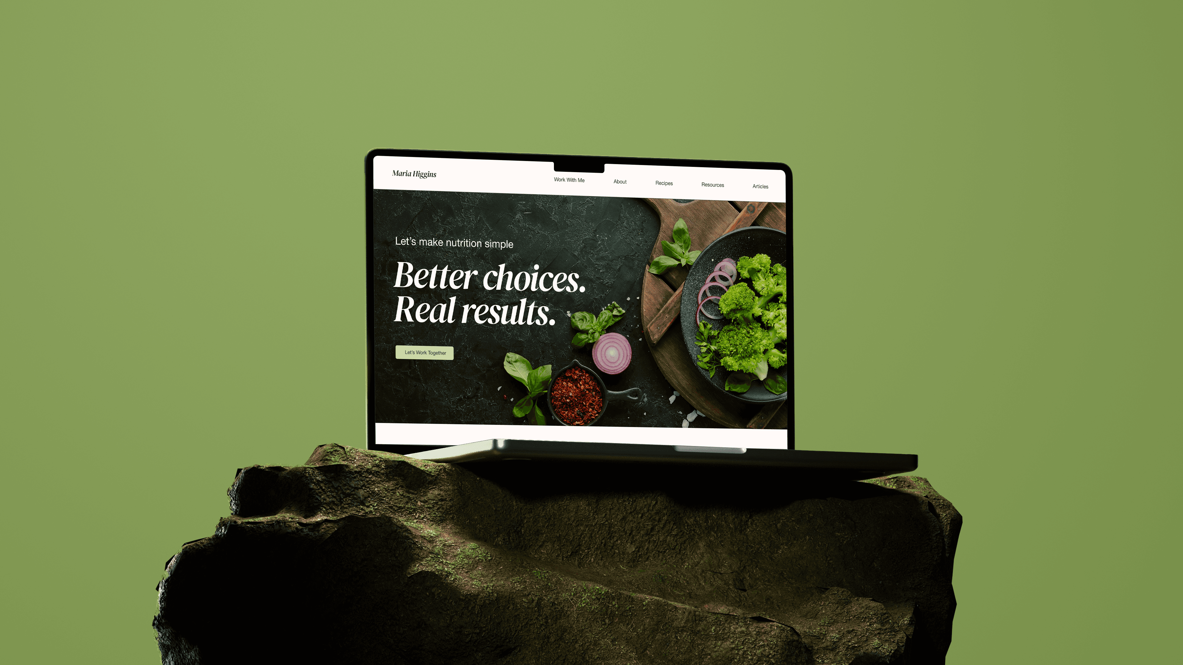
The problem.
“It just doesn’t flow.” — Maria knew something was off, but couldn’t name what.
Maria Higgins is a functional nutritionist with 8 years of experience. Her site was her main channel for discovery and booking, but visitors left without taking action.
They couldn’t answer three basic questions:
- Is Maria credible?
- What do I actually get?
- How do I sign up?
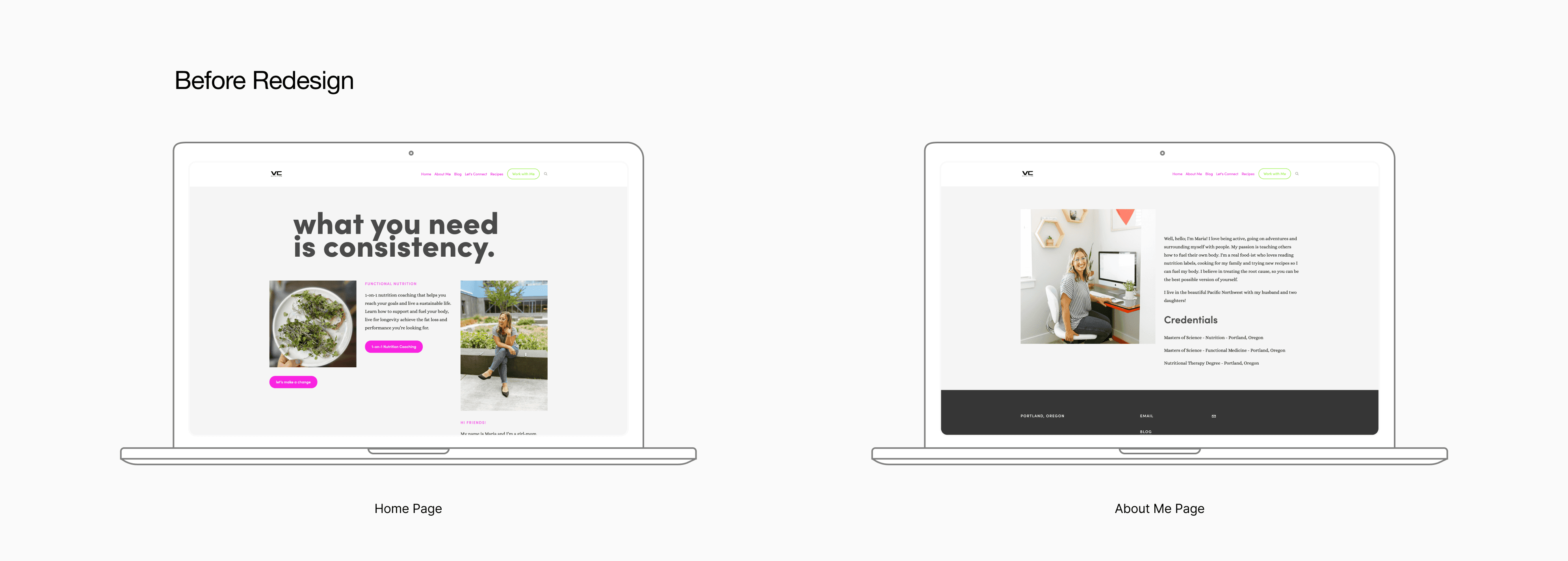
Heuristic evaluation — original site screens
My role.

I worked alongside two teammates in a 1-month sprint. While we collaborated on research, I took ownership of:
- Heuristic Evaluationidentified critical usability issues
- Information Architecturerestructured navigation and user flows
- Wireframescreated ~100% of layout explorations
- Design Systembuilt typography, color, and component library
- High-Fidelity Screensdesigned all final pages
- Brand Refinementtracked down original logo font and proposed new header treatment
Cassandra led client communication and Squarespace implementation. Daniel contributed to persona development and creative direction.
Research.
User interviews.
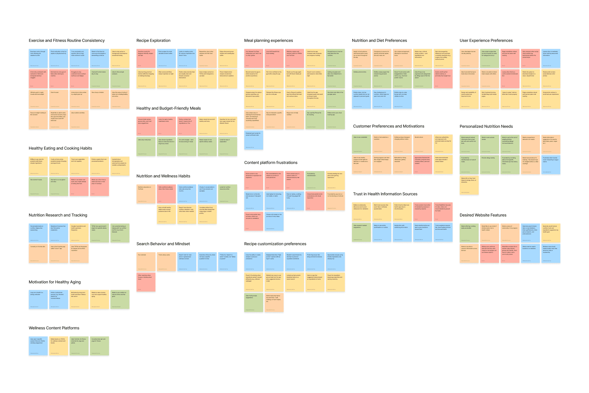
We talked to 5 people. What they said shaped every decision that followed.
I conducted 2 of 5 interviews. One participant, Claire, had a background in nutrition, which made her perspective on credibility especially valuable.
On what builds trust
“I need to know why I should believe them. Sources like Harvard Health are intrinsically trustworthy because they have the panel and background expertise. If they don’t list credentials, I leave.”
On what destroys trust
“If one website says something very different from others, conflicting advice, that’s a big red flag. People are very invested in their health.”
On user experience
“Some sites make you scroll through a life story just to get to a recipe. I just want my recipe, not the blogger’s entire backstory.”
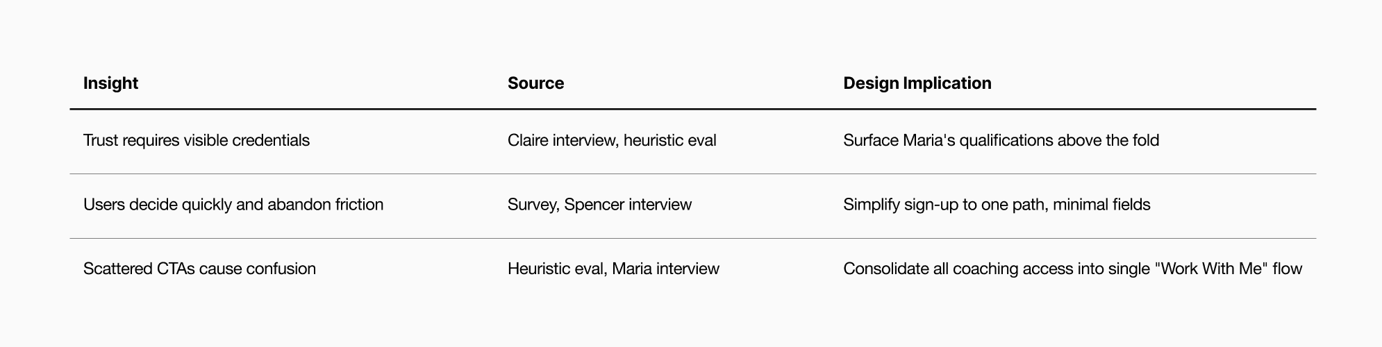
These weren’t isolated opinions. The same three things kept coming up across every conversation: show your credentials fast, don’t waste my time, and make the next step obvious.
Survey.
43 survey responses confirmed it: people leave sites that waste their time.
I created the survey and distributed it through Slack and Instagram. One frustration dominated: “Life story before recipe” appeared in 15+ responses:
- “The whole story leading up to the recipe”
- “Too much preamble”
- “Recipe all the way down the page, loaded with autoplay ads”
- “Having to scroll through a bunch of random stories/commentary”
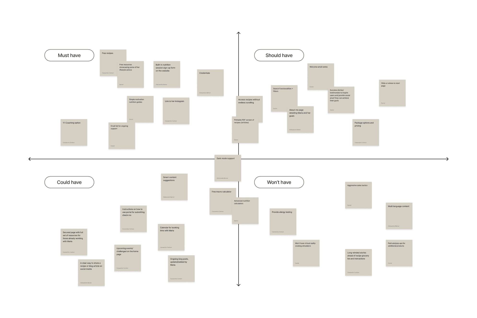
Decision impact: This directly informed our Moscow Matrix. “Long-winded stories ahead of recipes” went into “Won’t Have.” Not because storytelling is bad, but because our users told us it gets in the way of what they came for.
Persona.
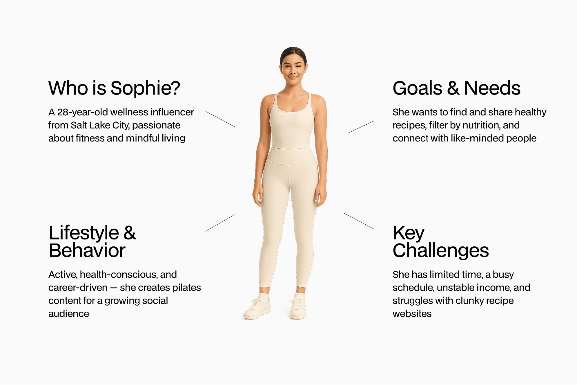
We created Sophie, a composite of our research patterns. Sophie helped us align as a team on who we were designing for, but the specific design decisions came from the heuristic evaluation and direct user quotes.
The redesign.
Three findings shaped everything we designed.
How might we…
…help busy users like Sophie quickly understand Maria’s value and take action — without overwhelming them or breaking their trust?
Restructuring the architecture.
The original structure had 3 CTAs leading to 3 different destinations, including an off-site Google Form. Users encountered “Work with Me,” “Let’s Connect,” and “1-on-1 Nutrition Coaching,” each routing somewhere different. The coaching sign-up led to an external Google Form with 10+ fields about health history, which completely broke the site experience.
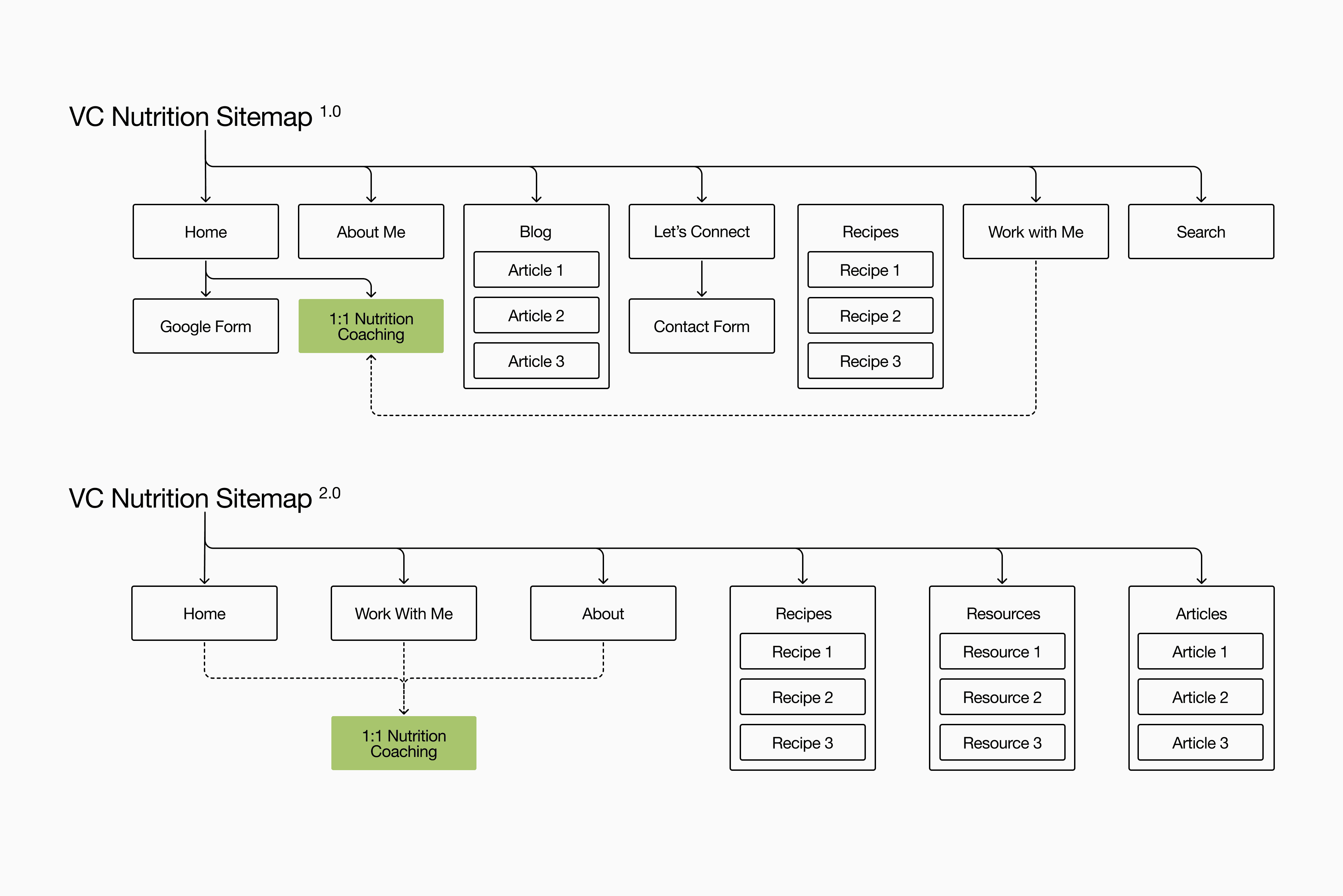
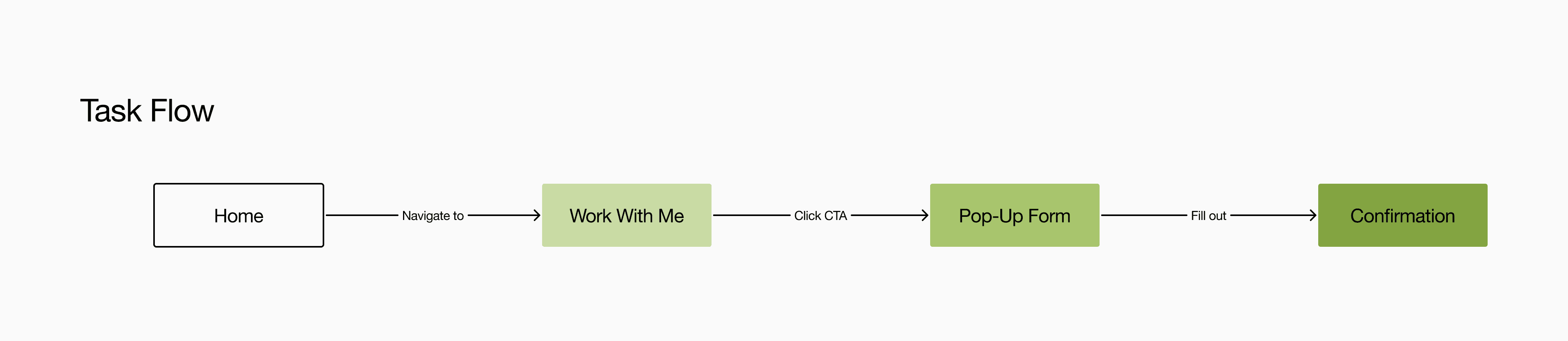
We consolidated all paths into one clear flow: Home → Work With Me → Sign Up
What I proposed and implemented:
- Merged all coaching CTAs into a single “Work With Me” page
- Replaced the external Google Form with an on-site pop-up (4 fields only)
- Added a “Resources” section for free content and early engagement
- Renamed “Blog” to “Articles” for clarity (users in our research found “Blog” ambiguous)
Refining the brand.
The athletic logo didn’t match the approachable coaching tone Maria wanted.
VC Nutrition is a sub-brand of VC CrossFit. The existing logo used CGF Locust Resistance, a condensed, aggressive font that fit CrossFit but felt wrong for personalized nutrition coaching for moms and busy women.
The problem: Cassandra had been using an approximation font because we didn’t have the original. The logo looked off.
My solution:
- Used reverse image search to find the exact original font (CGF Locust Resistance)
- Created proper horizontal lockup
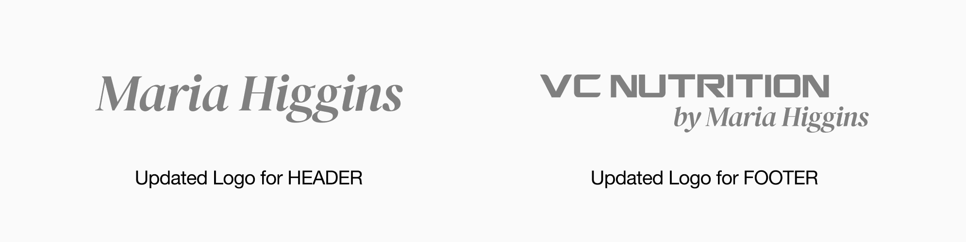
- Proposed splitting the brand presentation: “Maria Higgins” in header, “VC Nutrition by Maria Higgins” in footer
This balanced brand continuity with personal approachability, exactly what Maria’s target audience needed.
“I love love love the look!”
Design system.
A unified visual language reinforced the trust and clarity users needed.
I created both the style guide and component library — ensuring every element supported our goals of credibility and simplicity.
DM Serif Display (headings) — elegant, editorial feel. Helvetica Neue (body) — readable, modern.
Soft neutrals as base — calm, approachable. Sage green accent — replaced the original hot pink. In interviews, every participant mentioned credibility as a dealbreaker.
Buttons (primary, secondary, text states), recipe cards with prep time and dietary tags, testimonial carousel, sign-up form with inline validation, credential badges.
Final design.
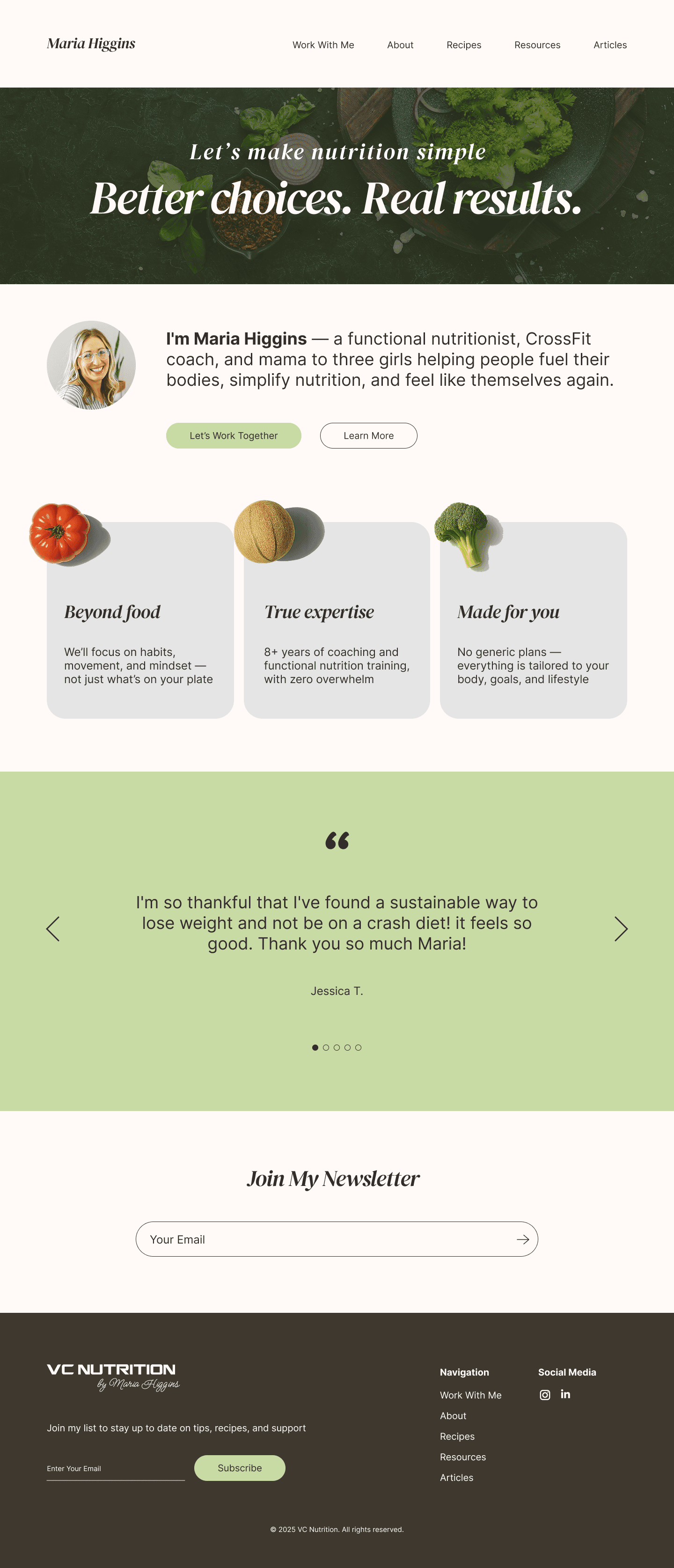
Team deliverable: clean, focused pages built for conversion.
This is the version we delivered as a team and Cassandra implemented on Squarespace.
Post-bootcamp: a full content ecosystem.
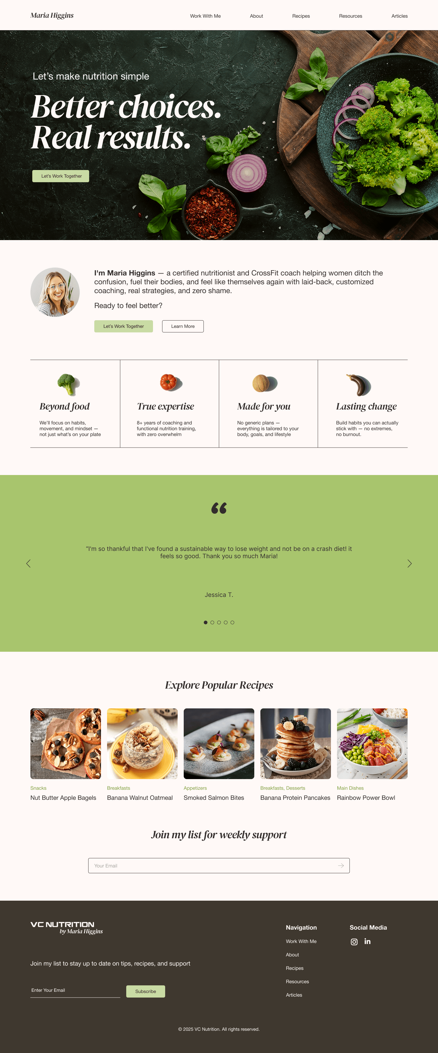
After the team project ended, I continued refining the design to match my vision of what the site could be, adding features Maria mentioned wanting but we didn’t have time to build.
What I added.
- Recipe system with filtering by goal, diet, and season
- Individual recipe pages with ingredients, steps, and download/print options
- Resources section with free guides (Balanced Plate, Plate Formula for Fat Loss)
- Enhanced About page with Mission, Vision, Promise framework
- Article templates with full content layouts
Main screens.
Recipes screens.
Validation.
Client feedback confirmed we solved the right problems.
“I love love love the look! It’s simple and the color scheme is great, the scrolling testimonial section I LOVE. SOOO excited to see this in action!”
Usability testing revealed one opportunity we’d address in future iterations.
Cassandra conducted a moderated test with Ariel (who we’d also interviewed earlier).
What worked
“Ooh, right away! Work with me.” — CTA was immediately findable.
What worked
“I love the clean design… the real food… the pistachio color.” — Visual direction resonated.
What worked
“Makes me want to work with her.” — Trust was established.
What could improve
“The credentials seems a little lackluster… I’d love to see that like an infograph.”
This feedback directly informed my post-bootcamp iteration. I explored more visual ways to present Maria’s qualifications.
Early signals of success.
3→1
CTA paths consolidated
Three competing buttons on the homepage ("let’s make a change," "1-on-1 Nutrition Coaching," "About Me") replaced with one repeating CTA and a single conversion path.
−60%
fewer form fields
Replaced an external Google Form (10 required fields, including open-ended questions and self-assessment scales) with an embedded 4-field pop-up. Removed the need for a Google login and eliminated context-switching.
6→11+
page types designed
Expanded from a basic 6-page site to 11+ page types, including a recipe system with search, filters, and structured recipe pages.
Reflection.
What I’d do differently: align research questions more tightly to business goals.
Our user research asked broadly about “what people want from nutrition sites.” This surfaced valid insights like the “life story” frustration but much of it applied to recipe sites, not coaching services.
Maria’s core problem was selling 1:1 coaching, not serving recipes. In hindsight, I’d focus interview questions on:
- “What would make you trust a nutrition coach enough to pay for their services?”
- “What makes you hesitant to book a call with someone new?”
The heuristic evaluation was actually more directly useful for this project than the general user research. It identified the exact friction points blocking conversions.
What I learned.
Heuristic evaluation surfaces what stakeholders can't articulate.
Maria knew something was wrong (“it doesn’t flow”) but couldn’t pinpoint that 3 different CTAs were confusing users. The audit made it concrete.
Trust is built through small, consistent signals.
You need credentials, testimonials, professional photography, and visual consistency. No single element creates trust on its own, but their absence destroys it.
Sometimes a "design problem" is actually an architecture problem.
The original site didn’t need better visuals. What it needed was clearer structure. IA work was the real solution.
Next
See all case studies.