- UX/UI Design
- Web Redesign
- 2025
I wanted to help,but I had no ideawhere to start.
A pet rescue nonprofit had people showing up ready to adopt, donate, and volunteer — but the site’s scattered structure, missing context, and broken flows stopped them cold. We restructured the information architecture, defined visual direction through preference testing with 12 users, and designed a system that turns good intentions into action.
Rescue NW
- Figma
- Photoshop
- Slack
- Google Meet
Cavanaugh Lefor
Avery Sullivan
+ ongoing independent iteration
Interactive prototype
Try the final flow.
The Figma prototype below covers the redesigned home, the restructured Adoptions / Donate / Volunteer flows, the filterable Available Pets carousel, individual animal profiles, the success-story system, and the mobile breakpoint.
Section 01
The problem.
“I was ready to donate, but the site didn’t give me enough confidence to follow through.”
SOS Lost Pet Rescue NW is a Beaverton-area nonprofit that rescues abandoned cats, provides medical care, and rehomes pets through community support. Their website is the primary channel for connecting with potential adopters, donors, and volunteers.
Each year, over 6.3 million animals enter U.S. shelters. Nearly 920,000 don’t make it due to lack of resources. SOS depends on its website to turn community goodwill into the adoptions, donations, and volunteer hours that keep animals alive. When the site creates friction, animals wait longer.
People came to the site motivated and ready to act. But the experience didn’t support that intent. Four core friction points stood out:
- The site lacked emotional connection to the animals and the organization’s purpose.
- Information was poorly grouped across pages.
- The donation experience felt unreliable.
- The overall visual layout felt disjointed, undermining the trust visitors needed to follow through.
Section 02
My role.
I worked alongside two teammates in a 1-month bootcamp sprint, then continued iterating independently after the project ended. While we collaborated on research, brainstorming, and UX decisions, I took ownership of:
- Information Architecturerestructured navigation and page hierarchy based on evaluation findings
- User Research Prepdesigned interview guides and organized research synthesis
- Mind Mapping & Insight Synthesisparticipated in affinity mapping to surface patterns across interviews
- Brand Voice Explorationhelped define the warm, approachable tone direction
- Preference Testing Supportcontributed to the visual direction A/B test between purple and blue palettes
- Wireframing & Prototypingcreated low-fidelity and high-fidelity screens
- Post-bootcamp iterationindependently expanded the design with success stories, detailed animal profiles, and refined flows
Avery conducted the initial user interviews and A/B preference testing, and helped organize the component structure in Figma. Cavanaugh conducted the final usability tests and created the majority of components for the bootcamp deliverable, including image carousels and product cards.
After the bootcamp ended, I redesigned every component from scratch as part of my independent iteration, rebuilding the full UI system to a higher level of polish and consistency.
Section 03
Research.
User interviews revealed three patterns: people want transparency, simplicity, and proof of impact.
We interviewed users with varying experience with animal rescue organizations. Three themes kept coming up:
- Adopters wanted medical history and temperament details before a payment form.
- Donors were willing to give but needed to see where money goes.
- Potential volunteers couldn’t commit without clear role descriptions and schedules.
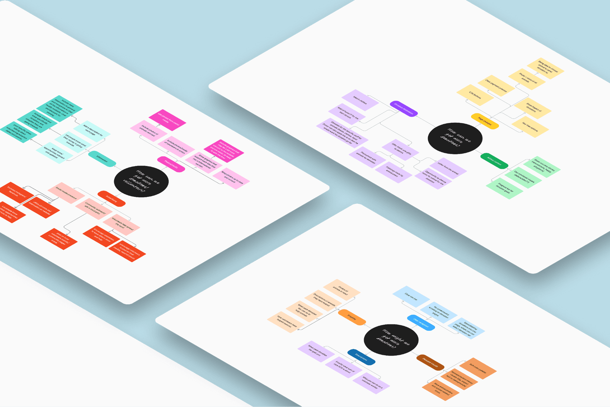
To turn those patterns into direction, each teammate created a mind map around “How can we get more donations/volunteers?” exploring empathy, tier transparency, CTA placement, and outreach. This helped us see where motivation begins and what interrupts it.
Mind map sketches
The mind maps gave us a long list of ideas. To decide what makes it into the redesign, we mapped them onto a MoSCoW matrix.
The biggest ideas that made it in: success stories to build emotional trust, donation tiers with clear impact descriptions, and updated content and animal photos on every page. Ideas like “name the animal” or painting gifts from animals were fun but not critical, so they went to Won’t Have.
We created Ruth Beck to keep every decision grounded in a real user’s needs.
Ruth is a 44-year-old office worker and single mom in Portland, a composite of our research patterns. She wants to give back after recently adopting a cat, but she has limited time and money. If the process isn’t simple and purposeful, she won’t follow through.
Quote cards from the interviews
“It would warm my heart just to see what I was helping to achieve.”
That became a guiding lens for what the site needed to provide.
Section 04
The redesign.
Restructuring the architecture.
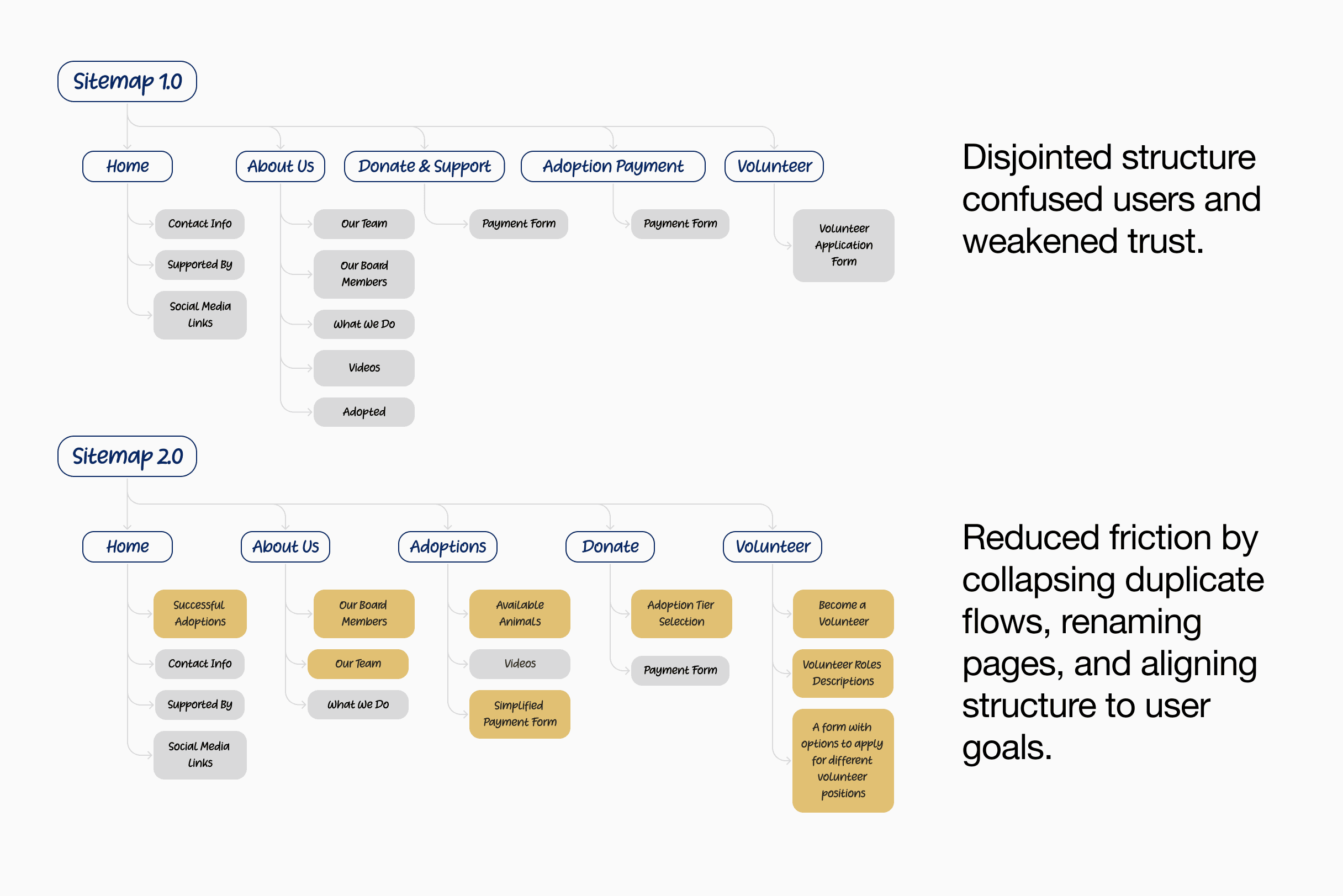
The original sitemap had a disjointed structure that confused users and weakened trust. “Donate & Support” and “Adoption Payment” existed as separate top-level pages with overlapping payment forms. Volunteering was a dead-end form with no context.
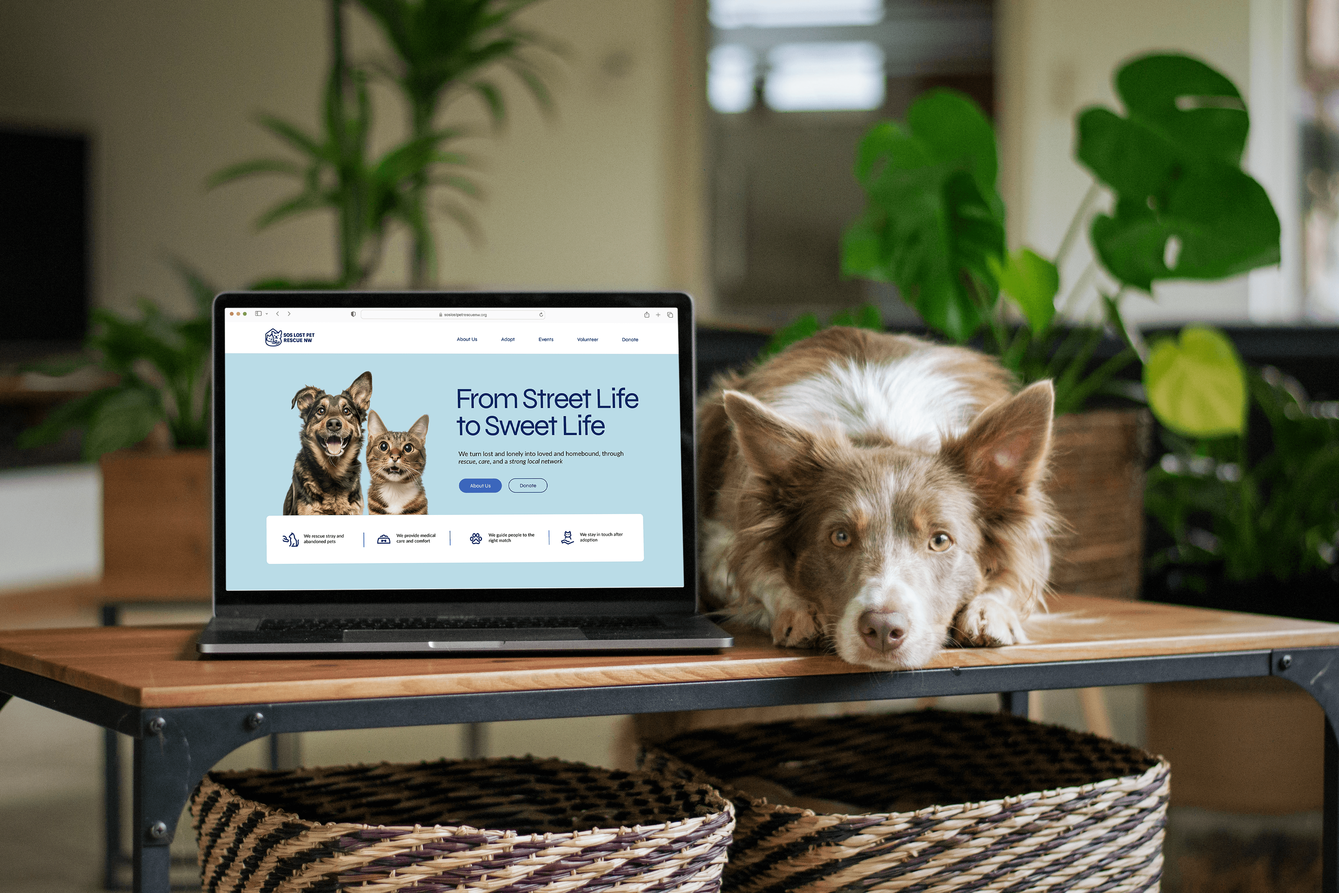
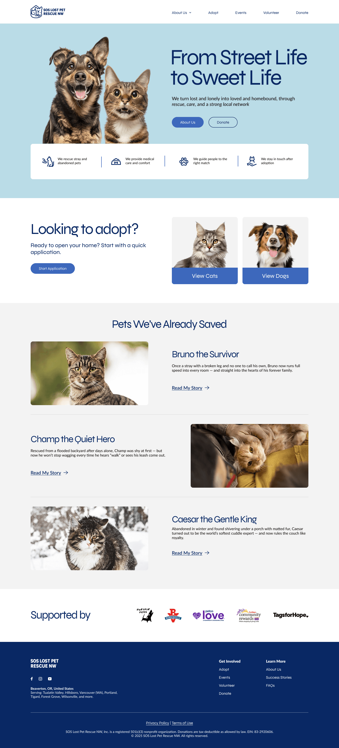
The new structure separated Adoptions (browse animals first, then pay) from Donate (choose a tier, see the impact). Volunteering got its own section with role descriptions and scheduling. “About Us” was streamlined. And Success Stories moved to the homepage to build emotional trust from the first scroll.
We also prioritized animal photography throughout. The original site was almost entirely text-based, with very few images of actual animals, which undermined the emotional connection the mission depends on.
The key structural change: users could now browse available animals through a filterable carousel — sorted by age, breed, and type — before encountering any payment flow. The original site had no way to view adoptable pets at all, jumping straight to payment.
Section 05
Final design.
Clear, action-oriented pages built for people ready to help.
The redesigned site includes six core pages: Home, About Us, Available Pets (Adoptions), Donate, Volunteer, and Success Stories. We delivered a high-fidelity prototype in Figma covering both desktop and mobile breakpoints. The mobile version adapts to a 6-column grid with a sticky hamburger menu, adjusted carousels showing two animals per slide instead of four, and stacked layouts for content that sits side-by-side on desktop.
Main screens.
Section 06
Validation.
Usability testing surfaced clear wins — and a precise list of what to refine next.
Validated wins
What worked
Clear layout and CTA made users feel confident and ready to engage.
What worked
Visuals felt trustworthy and welcoming.
What worked
Form flow encouraged action — both donate and volunteer.
Needs improvement
What could improve
Add clarity around adoption vs. payment.
What could improve
Expand volunteer role descriptions.
What could improve
Make filters more visible and labeled.
What could improve
Let users click cards for deeper info.
Section 07
Early signals of success.
100%
understood paths
Participants in usability testing said they now clearly understood how to donate or volunteer after navigating the redesign.
2x
filter usage
Every test participant explored the new filter feature on the Available Pets page — calling it “helpful,” “time-saving,” and “easy to use.”
3x
more time on rescue stories
Users spent significantly more time reading animal success stories, often citing them as the reason they wanted to help.
Section 08
Reflection.
I would narrow the interview questions around donation intent earlier.
Our interviews covered adoption, donation, volunteering, and usability across every participant. That breadth was useful for understanding the full picture, but in hindsight, the donation-related findings were the thinnest — we asked broad questions about giving habits rather than probing specifically into what information would make someone donate on the spot. If I ran this again, I’d include a scenario-based question where participants walk through the donation page and narrate their decision in real time.
The heuristic evaluation was more actionable than I expected.
I initially thought the interviews would drive most of our design decisions. In practice, the independent site audits each team member ran gave us the sharpest, most specific problems to solve: the payment form design undercutting trust, stock imagery draining emotional impact, volunteer descriptions being too vague. The interviews confirmed and added nuance, but the evaluation gave us a concrete list of fixes from day one.
Rebuilding the IA was the highest-leverage decision I made.
Collapsing “Donate & Support” and “Adoption Payment” into distinct, goal-oriented sections (Adoptions, Donate, Volunteer) changed how every page functioned. It was tempting to focus on visual polish first, but restructuring the sitemap before touching any screens meant every design decision downstream had a clear home. I would make that same call again.
Redesigning everything post-bootcamp taught me more than the bootcamp itself.
Going back to rebuild all the wireframes and components alone, without the pace of a team sprint, forced me to question every layout choice on its own merits. Some decisions I had agreed with during the group project turned out to be compromises rather than solutions. Having the space to revisit them made the final product significantly stronger — and it changed how I evaluate my own work in progress.
Next
See all case studies.