Decision 01
Three pillars, not ten equal services
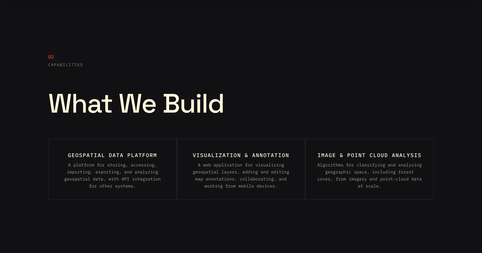
I grouped the offer into a geospatial data platform, visualization and annotation, and image and point-cloud analysis. Visitors can scan the company’s shape first, then move into technical detail.
Overview
I shaped the positioning, information architecture, identity, responsive interface, and production delivery—turning a long technical capability list into one coherent, accessible company website.
Devake works across maps, satellite imagery, LIDAR, point clouds, cloud systems, and custom applications. Presenting every capability at the same level made the company harder to understand. The site also had to communicate credibility without exposing confidential client details or relying on unsupported performance claims.
Questions the interface had to answer
What does Devake actually build?
How does the work feel specialist, not obscure?
How can motion stay usable for everyone?
Decision 01
I grouped the offer into a geospatial data platform, visualization and annotation, and image and point-cloud analysis. Visitors can scan the company’s shape first, then move into technical detail.
Decision 02
Menu placement became a real stakeholder question. I published three working header variants so the decision could be made in context, not from a static mockup. The selected system keeps desktop destinations visible and turns into a full-screen, keyboard-operable menu on mobile.
Closed
Open
Decision 03
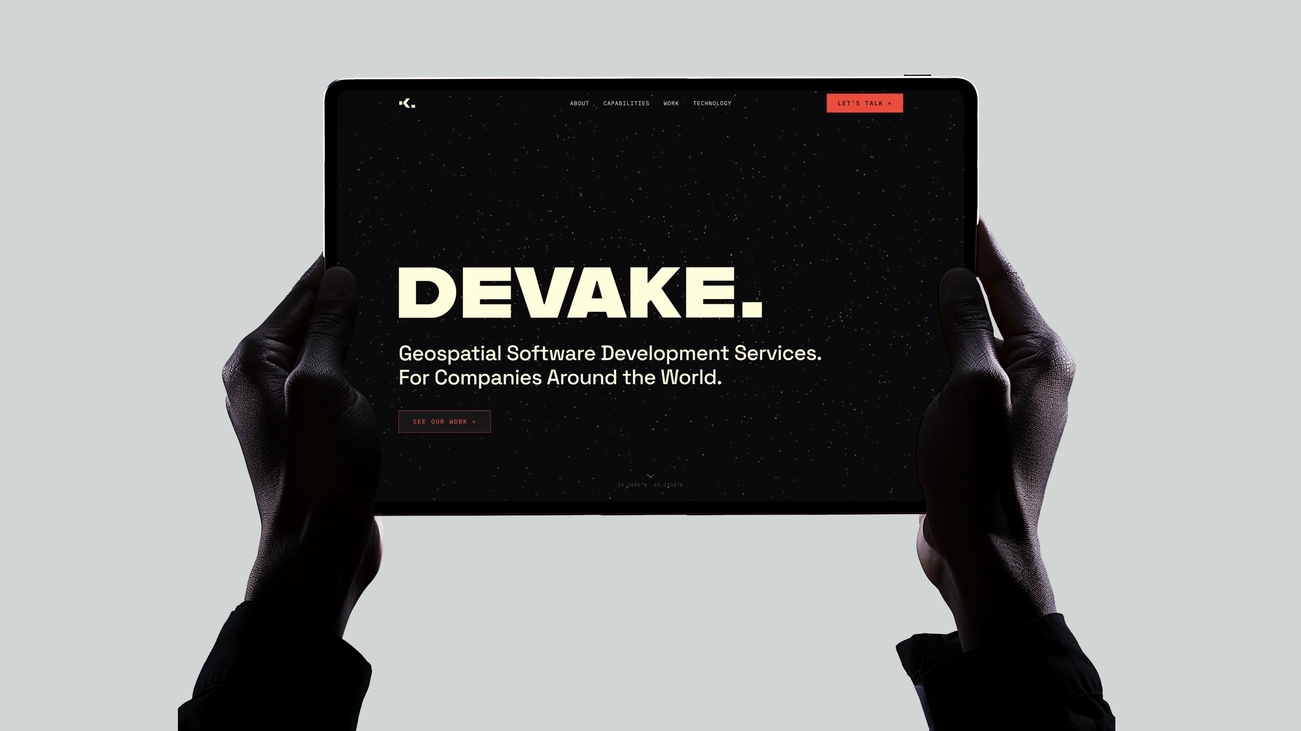
A custom geometric mark, an animated field of points, oversized type, coordinates, and fine rules suggest location and precision. Warm ivory and a single red action color keep the system expressive without turning it into a literal map interface.
Decision 04
The interface was designed toward WCAG 2.2 Level AA and reviewed with automated checks, keyboard navigation, and screen-reader testing. This is an ongoing target, not a claim of formal certification.
Semantic landmarks, logical headings, and a skip link
Visible focus and a modal menu with focus restoration
Accessible form names, required states, and native validation
Reduced-motion support and screen-reader alternatives

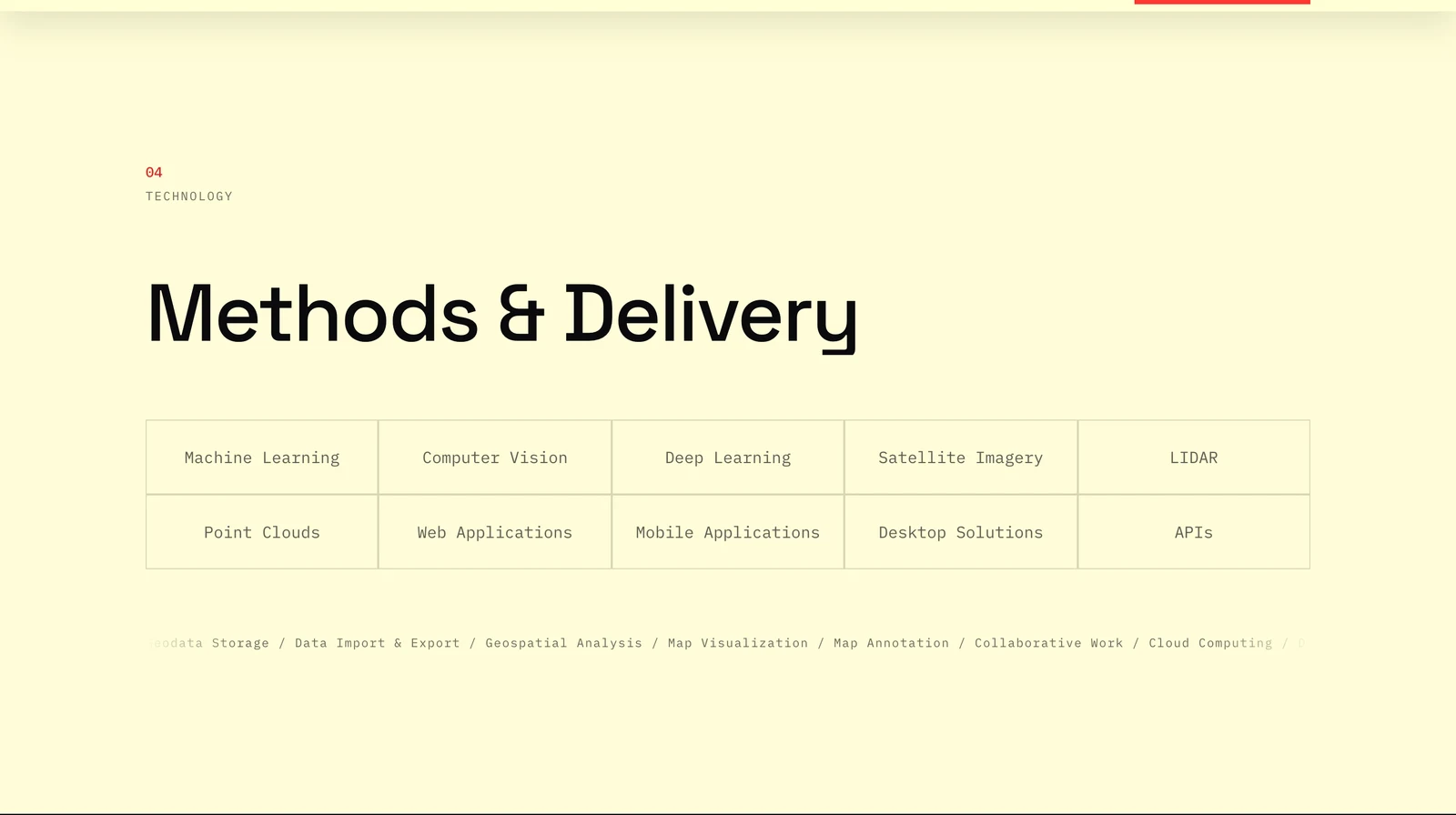
The final one-page experience carries the same hierarchy from the spatial hero through capabilities, selected work, technology, and contact. The production site is static, versioned in Git, deployed to Azure, and supported by QA and handoff documentation.
devake.com

Hero
Capabilities
Technology
Contact
3
capability pillars
Ten specialist services became three memorable parts of one offer.
5
navigation destinations
The final journey moves from context to proof, technology, and contact.
10
regression checks
The handoff build protects accessibility, privacy, routing, and scroll behavior.
The reviewed release uses no analytics, pixels, third-party embeds, cookies, or persistent browser storage. Its inquiry form opens a draft in the visitor’s email app, keeping the first contact private and lightweight.
Ownership & handoff
I worked independently with direct CTO review, published three navigation variants for selection, and prepared the final repository, deployment notes, compliance review, and QA documentation. The Devake logo was designed by Aleksandra Beiner; original source files and dated project history are retained.
Next project
Open Conclave